There comes a point where a software project stops being about what you can build, and starts being about what other people have to live with. RafflesGo felt like one of those projects.
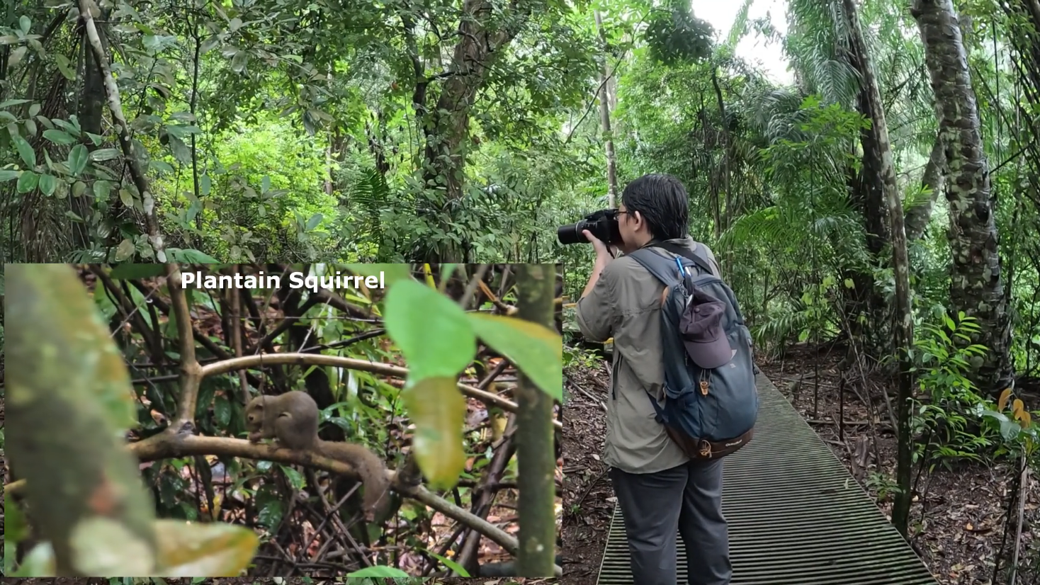
Built as part of NUS CS3213, it had to support a real conservation workflow for the Raffles' Banded Langur Working Group, one that was still heavily dependent on Google Sheets and a great deal of manual follow-up across every survey cycle.
That changes the engineering question immediately. Once a system is meant to support a real workflow, it stops being about how many features you can squeeze into a demo or how clever the architecture looks on a slide. The more important question becomes much simpler and much harder: can the system remove the small frustrations that keep repeating across every survey cycle?
RafflesGo had to respect field conditions and the sensitivity of sighting data while still reducing the coordination burden on organisers. That is why the eventual outcome mattered. The project did not satisfy every possible requirement, nor were we trying to force a rushed deployment by the end of the semester. But it fulfilled enough of the right needs for our team to be selected as one of three teams out of eleven for a real follow-up initiative with the organisers after the course ended. For a school project, that was the strongest signal we could have asked for: not that the system was perfect, but that it was credible enough to keep building.
Software Engineering is a wicked problem...
The requirements analysis were difficult, not because the app had to replace a spreadsheet-and-email workflow, but because the requirements themselves were intentionally a little messy in the way real software requirements often are. They were often ambiguous, open to interpretation, and two reasonable readers could walk away with different assumptions about what the stakeholder actually wanted.
That was not accidental. Before the semester even began, the teaching team had already spoken with Dr. Andie Ang and attempted the project themselves, using those earlier discussions to clarify edge cases and understand what a strong outcome for the next cohort might look like. The initial requirements we received were therefore not a watered-down classroom fiction, and definitely not a perfect blueprint.
We had to do the interpretive work ourselves. Questions raised during group discussions with our mentor were answered depending on the quality of the question. If we asked something vague, we got back something that still left room for ambiguity. If we failed to ask the important question at all, the ambiguity stayed hidden until much later.
That is what made the project feel real. A large part of the work was figuring out what was actually important, and which pain points mattered enough that the system had to be shaped around them.
As such, the Software Requirements Specification (SRS) was essentially our best attempt to formalise what we believed Dr. Andie expects from the system. The end result was a product that had to do several things at once:
- let volunteers browse and join survey slots
- support structured sighting and incident reporting
- allow report drafting and later submission
- work in low-connectivity conditions
- enforce role-based visibility over reports and participation
- reduce administrative effort for coordinators running the programme
These constraints shaped the product far more than any technology preference did. The field context is also what turned seemingly ordinary features into non-negotiable ones. Offline draft handling, for example, was not a convenience feature added for polish. It was necessary because survey walks may happen in places where connectivity drops. Likewise, the distinction between volunteer access and administrator access was not simply a neat RBAC exercise. It existed because the data was useful, but also sensitive.
UI/UX Design Specification
Like most projects, RafflesGo benefited from having a design direction early, before implementation details had the chance to pull the interface in too many competing directions. The visual goal here was fairly clear from the start: a calm, nature-inspired product that felt appropriate for a conservation workflow without turning that theme into decoration for its own sake.
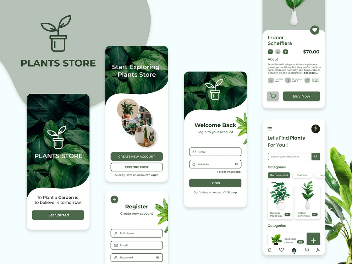
With that direction in mind, I started looking for a UI reference that could support the kind of experience RafflesGo needed. The goal was not to find something flashy, but something calm and easy to parse at a glance, especially for users who would be repeatedly checking schedules or filling in forms.
That search led me to Zeeshan Hamayoun's UI Design for a Plants Store app. What stood out was not the subject matter itself, but the interface discipline: restrained typography and a layout that stays readable without feeling visually empty. That was much closer to what RafflesGo needed than a louder or more decorative design language.
These kinds of design component specifications matter because they reduce the cost of evolving the application mid-project. Once the team has settled the basic visual primitives, later feature work does not have to renegotiate the visual language from scratch. For a semester project with several moving workflows, that consistency is what stops the product from turning into a collection of disconnected screens.
From Mockup to Reality
The implemented interface makes the product direction legible quite quickly, and what works especially well in the final implementation is that the same UI language survives across both volunteer-facing flows and heavier administrative screens.
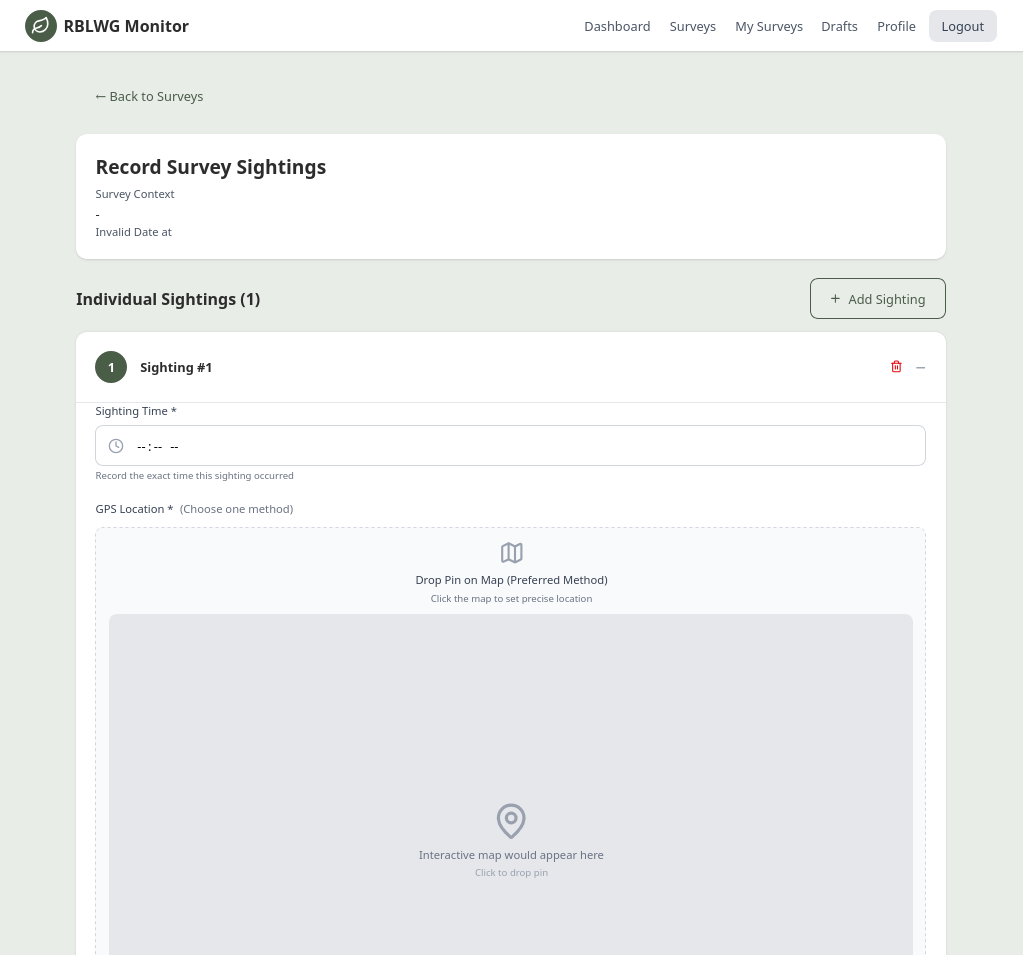
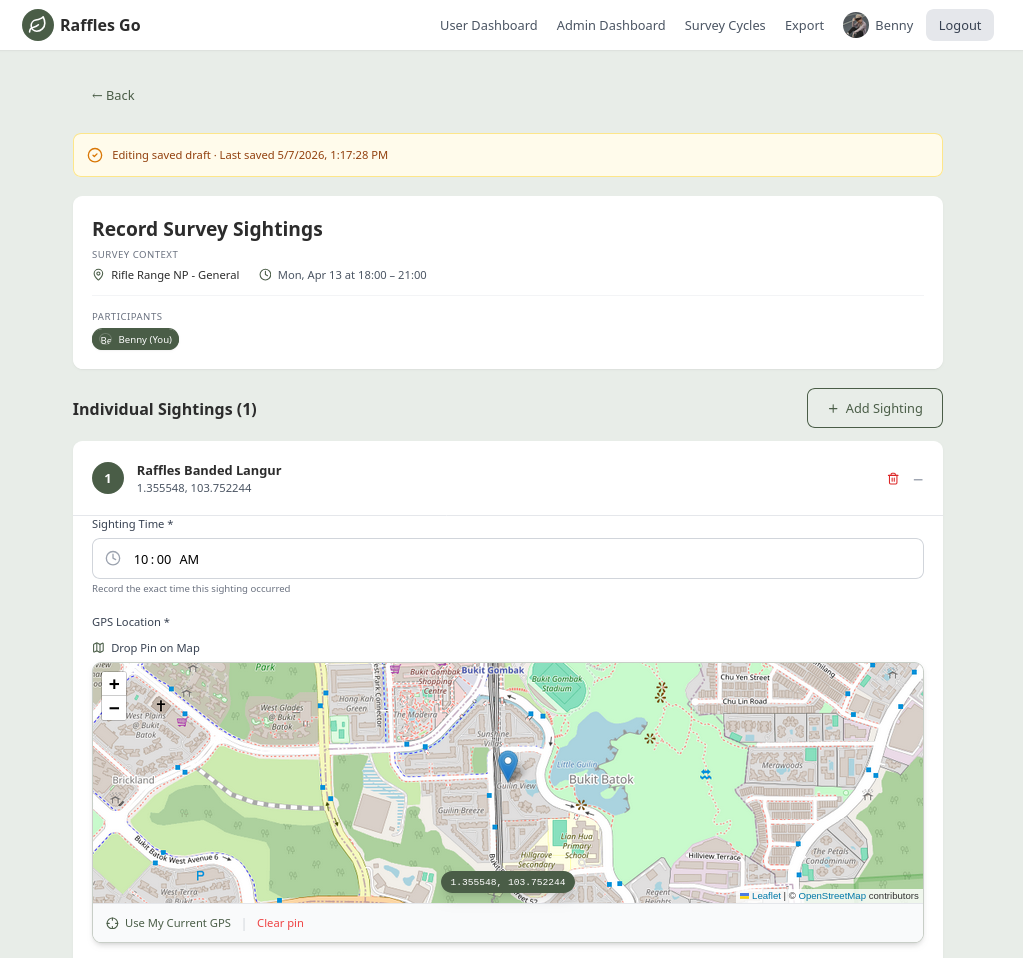
In this image comparison, the left side shows the original mockup generated by Figma Make, while the right side shows the final UI screenshot from the implemented project.
Keeping The Product Coherent
The final product also benefited from being built with a tech stack that encouraged structure instead of accidental drift. On the backend, using Fastify together with OpenAPI gave the team a much cleaner way to define what the system actually exposed, and what the frontend could reliably expect in return.
That mattered more than it might sound at first. RafflesGo was a monolithic system, but not a small or static one. It was expanding in multiple directions at once, while the team still had to work in parallel under tight semester deadlines. That is usually where a codebase starts accumulating coordination debt unless someone is constantly stepping in to keep changes aligned.
The value of an explicit API contract was therefore less about technical elegance and more about reducing coordination overhead inside the team itself. Instead of treating the backend and frontend as two loosely aligned guesses, OpenAPI gave both sides a shared reference point. That made it easier to move faster without having to repeatedly reconcile small mismatches by hand.
In practice, this is the sort of engineering decision that rarely looks glamorous in a showcase, but quietly determines whether a project stays maintainable once the feature count grows. RafflesGo needed that discipline because the team was moving quickly while still refining its interpretation of what the stakeholder actually needed.
What happens now?
Unlike PeerPrep, where the natural continuation of the story was infrastructure and deployment architecture, the more interesting continuation for RafflesGo is stakeholder adoption. That is what made this project feel different by the time the semester ended.
Our team did not leave the course thinking the work was fully complete, nor that every requirement had been perfectly resolved. If anything, the semester made it clearer how much careful follow-up real deployment work still demands. But we did leave with something more valuable than a polished classroom ending: evidence that the system was useful in the right ways.
Being selected as one of three teams out of eleven for continued follow-up with the organisers meant the project had crossed an important threshold. It was no longer being judged only as a student submission, but as a candidate foundation for a tool that real volunteers might eventually use in the Raffles' Banded Langur Working Group's citizen science programme.
That next phase is especially meaningful because it shifts the work away from our team's interpretation alone. During the semester, much of the challenge was formalising ambiguous requirements into something buildable. After the semester, the work becomes more direct: working more closely with organisers, and moving toward a system shaped less by inference and more by actual operational fit.
To me, that is a much stronger outcome than simply saying the project was "done." A project like this should not be considered successful just because it reached the end of a grading rubric. It becomes successful when the people it was meant to serve can look at it and say: yes, this could genuinely make our work easier.
Testimonials
Professor testimonial placeholderInsert the final quote here once received.
What began as a project assignment for NUS CS3213 evolved into a solution with genuine potential for real-world deployment. The group demonstrated a strong commitment to understanding and addressing the pain points faced by both volunteers and organizers within the Raffles' Banded Langur Working Group (RBLWG) Citizen Science Programme.
Throughout the project, the group successfully fulfilled the key requirements and expectations that I briefly communicated at the start of the project. Additionally, suggestions raised during the demonstration sessions were implemented promptly, reflecting their technical competence and dedication to delivering a high-quality solution.
Under the leadership of Lee Jia Quan, the team worked cohesively and efficiently while maintaining a strong focus on stakeholder needs. Their ability to balance technical execution with client requirements resulted in a product that was thoughtfully designed to serve its intended users.
I am pleased to commend the team's professionalism, adaptability, and collaborative spirit. Their efforts exemplify the qualities of an effective software development team and showcase the practical impact that student-led projects can achieve when guided by a clear understanding of user needs.
Dr. Andie, 14 June 2026
Closing Thoughts
RafflesGo stayed with me because it clarified what kind of engineering work feels worth doing. There is nothing wrong with enjoying the craft itself, or the satisfaction of getting a system to behave exactly as intended. But once a project has a credible chance of helping real people doing meaningful work, those things stop being the centre of gravity.
What starts to matter more is whether the product respects the people who have to rely on it. Did it remove friction from the volunteer trying to submit a report after a long survey walk? Did it make life easier for the organisers who have to run the programme cycle after cycle? Those are quieter questions than "what tech stack did you use?", but they are the ones that decide whether a system deserves to exist.
That is probably the lesson I value most from this project. Good software engineering is not only about building more. Sometimes it is about noticing which frustrations keep repeating, and being disciplined enough to solve them without distracting yourself with unnecessary cleverness.
If RafflesGo eventually contributes, even in some small way, to helping the people behind Singapore's conservation efforts work a little more smoothly, that would matter far more than any semester grade ever could.